PNC Virtual Wallet Redesign
Created in Sketch.

This personal project served as a means for me to hone my UI design skills via iterative user testing. This testing was completed in an interview-style format and utilized interactive Sketch prototypes to assist in the process.
Existing Design and Initial User Studies
Some of the problems I noticed with the existing design were inconsistencies in iconography, inefficient use of space, and the inclusion of product features - particularly on the home page - that seemed irrelevant to the page’s primary functions. I tested these existing screens with users to determine if there were any changes I could implement beyond my initial impressions.
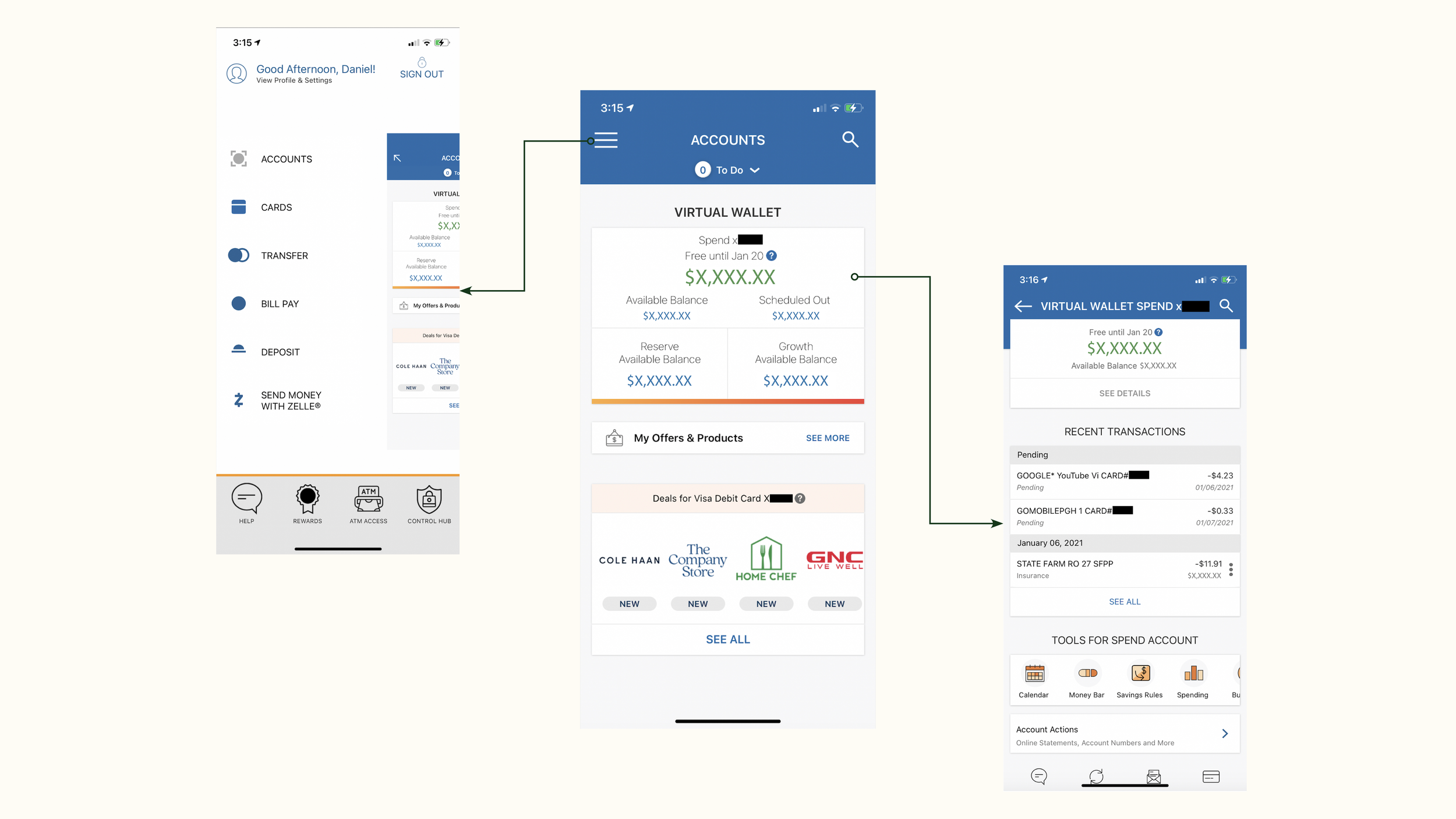
I conducted interviews with a set of users of varying age, occupation, and technological savviness. I asked for their thoughts on the mobile banking app they currently use, in addition to showing them screenshots from the existing PNC Virtual Wallet app. I used Sketch to mimic an interactive UI. After analyzing and aggregating the users’ responses, the following conclusions were made and used to inform the initial prototype of my redesign:
Users primarily open their mobile banking apps to view account balances and deposit checks
It’s unclear how a user might view their account details
55% of users specifically noted that they disliked the “Deals for Visa Debit Card” section of homepage
The collapsible navigation bar should be replaced with a static menu at the bottom of the page
There should be more visualizations that assist users in tracking their spending
Initial Prototype and Secondary User Studies
I created this initial prototype incorporating feedback from the first round of user interviews. This included new features such as a visualization of the user’s account balance over time, a spending tracker that automatically categorizes expenses, and a new static menu bar at the bottom of the page. Features that require quick access such as check depositing and funds transfers were relocated to the center of the home page, while other essential features were placed in the static home bar at the bottom of the screen.
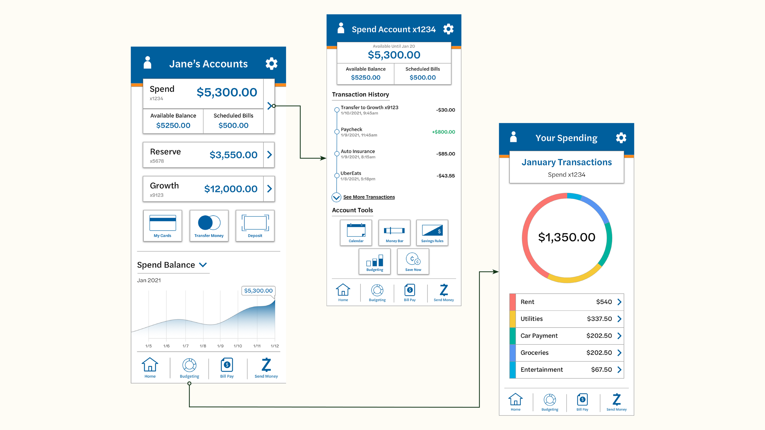
After building the initial prototype, I created a new set of questions and interviewed the same group of users to gather feedback for the final design. This included general questions about design and navigation clarity, in addition to A/B style tests asking users to rank two or more designs based on their personal preference. The following conclusions were made based on user feedback:
Users wanted to see options for both dark and light modes
Users sought more customization within the “Your Spending” page including the ability to create budgets for each spending category and an option to auto-deposit excess funds into their savings at the end of the spending period
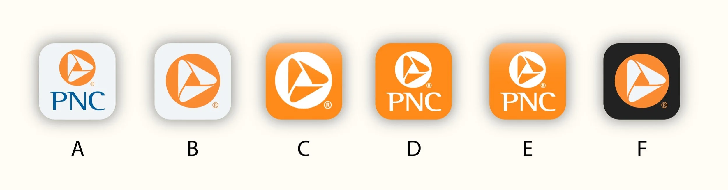
In addition to testing the initial redesign prototype, I also created a series of revised iOS home screen icons to test with users. I used a ranked-choice systems to receive feedback on the six different options, which returned option B as the overall favorite for this group of users.
Final Design
This final design incorporated major adjustments to the “Your Spending” page of the application, adding a budgeting feature that enables users to create an ideal spending limit for each category in the spending tracker. This tool allows users to set their monthly income, add or delete categories as they see fit, and auto-deposit excess funds from their spend account into their savings account at the end of the spending period. The design also incorporates an option for dark mode, which was a popular request among my group of users.

Reflections
Overall, I think that the new screens I created for the app are an improvement over the existing design, and was happy with the addition of the new spending & budgeting feature. However, in retrospect I think that creating a screen for each clickable item on the home page would have given my group of users a better idea of the new design’s functionality, and provided much better feedback for my final iteration. I also would have liked to conduct more than two rounds of user interviews, however since this was a personal project and I was unable to provide any compensation for their time, the users already showed signs of fatigue into the second round of interviews.